
The Psychology of Colour in Personal Spaces
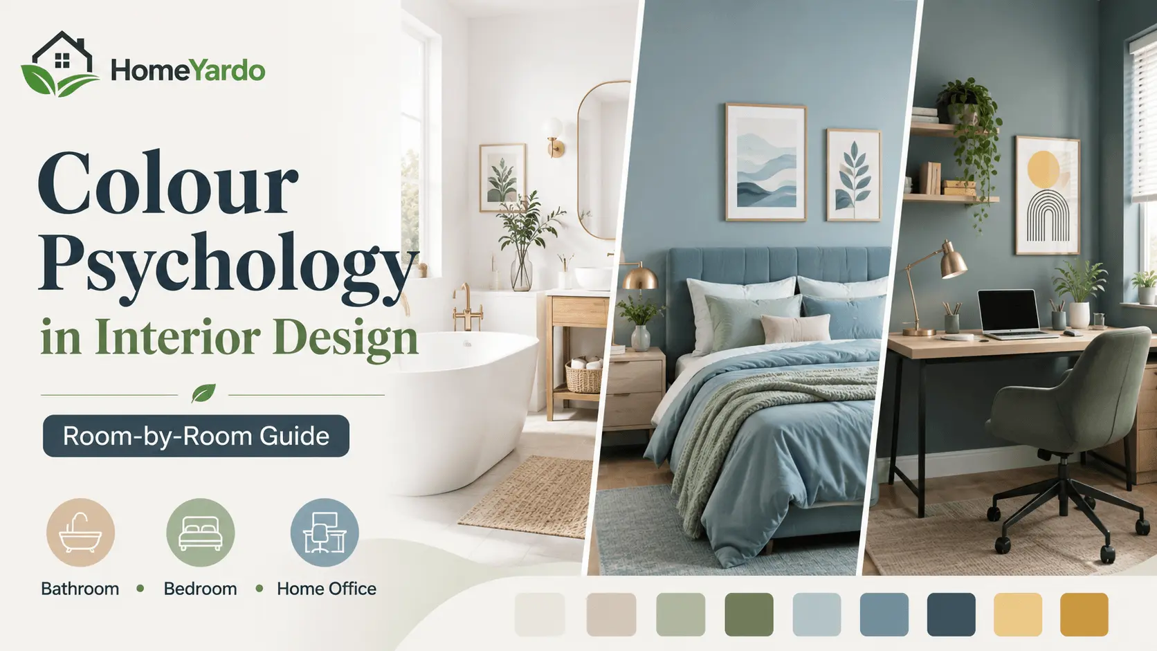
Colour is one of the easiest ways to change how a room feels. A wall can make a space appear brighter, softer, warmer, quieter or more energetic without changing its layout or furniture. That is why colour psychology in interior design has become an important part of interior design.
The same colour can also feel very different depending on where it is used. A bright yellow that feels cheerful in a home office may feel too stimulating in a bedroom. A cool blue that creates a peaceful atmosphere in a bedroom may make a bathroom feel crisp and clean. The amount of natural light, the finish of the surface, the size of the room and even personal preferences can change the effect.
Research supports the idea that people form consistent associations between colours and emotions. A 2025 systematic review examined 132 studies involving more than 42,000 participants across 64 countries and found recurring links between colours and emotional responses. Light colours were generally associated with more positive emotions, while blue, green and white were often linked with lower-arousal positive emotions such as relaxation and contentment. The researchers also stressed that these are associations rather than guaranteed psychological effects in every real-world room.
That distinction matters when choosing colours for your home. Instead of treating colour psychology as a strict set of rules, think of it as a useful guide for creating an atmosphere that matches the purpose of each room.
How Colour Psychology Works in the Home
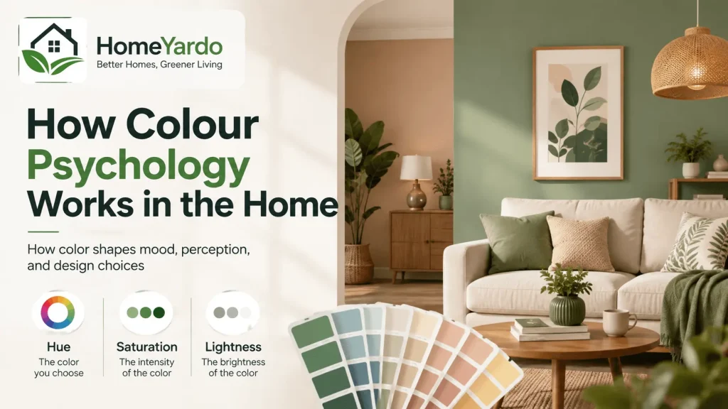
Colour psychology looks at how colour can relate to perception, emotion, cognition and behaviour. Researchers have studied colour for more than a century, although the strength of the evidence varies depending on the colour, environment and outcome being measured.
A major review published in Annual Review of Psychology found evidence that colour can influence affect, cognition and behaviour, while also noting that the field still has limitations and that results can depend on context.
This means there is no universal rule such as “blue always makes you calm” or “red always makes you anxious.” People respond to colours through a mixture of visual properties, previous experiences, culture and the environment in which the colour appears.
Three characteristics are particularly important:
- Hue: the basic colour family, such as blue, green, red or yellow.
- Saturation: how intense or muted the colour appears.
- Lightness or brightness: how light or dark the colour is.
Research has found that these properties can change the emotional associations people have with a colour.
This explains why a pale blue bedroom and a highly saturated electric-blue bedroom can create very different impressions, even though both technically use blue.
For home design, the practical lesson is simple: choose the colour, intensity and finish together rather than looking at the colour name alone.
Creating a Calm Bathroom with White
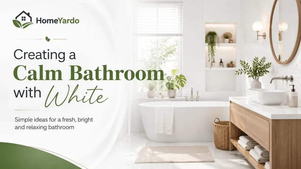
White has long been associated with cleanliness, simplicity and order, making it a natural choice for bathrooms. It also reflects a large amount of available light, which can make a small bathroom appear more open.
The psychological association is also supported by wider colour research. White has been linked with positive, lower-arousal emotional responses in systematic research on colour and emotion.
That makes white particularly useful when the aim is to create a bathroom that feels fresh and uncluttered.
A bright white wall can help establish a clean visual starting point. When combined with good lighting and simple fixtures, it can make the room feel more spacious without changing its physical dimensions.
For a modern, moisture-resistant finish, you could also consider white satin PVC wall cladding instead of traditional ceramic tiles. It provides a smooth, seamless surface and can be easier to maintain in areas exposed to moisture.
The finish matters too. A highly glossy white surface reflects more light and can make the bathroom feel bright and crisp. Satin finishes provide some reflection without the strong shine of a high-gloss surface.
How to Stop a White Bathroom Feeling Cold
An entirely white bathroom can sometimes feel more clinical than comfortable. You do not need to abandon white to solve this. Instead, introduce a few warmer materials and natural details.
Consider:
- Light or medium-toned wooden accessories
- Green plants that tolerate bathroom conditions
- Natural stone or stone-effect details
- Warm-toned towels
- Soft lighting
- Brushed metal fixtures
- Small areas of beige, cream or muted green
The goal is to give the eye some variation while keeping white as the dominant colour.
A useful approach is to think of white as the background rather than the entire design. The walls can provide the clean, bright base while accessories introduce warmth and personality.
This also makes future changes easier. Replacing towels, mats or accessories is much simpler than repainting the entire room.
How Bedroom Colour Can Support Relaxation
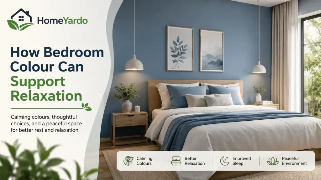
The bedroom has a different purpose from the bathroom. It is where you want visual stimulation to decrease so that the room feels comfortable at night.
Blue and green are commonly associated with calm and lower-arousal emotions. The recent systematic review of colour-emotion research found recurring associations between blue, green, green-blue and white and positive, lower-arousal emotional states.
That does not mean painting your bedroom blue will automatically improve your sleep. Sleep is affected by many factors, including light exposure, temperature, noise, stress, mattress comfort and bedtime habits. Colour should therefore be treated as one part of the overall bedroom environment.
Choosing Blue for a Bedroom
Soft blue can work well when you want the room to feel quiet and restful.
Instead of choosing the brightest blue available, consider:
- Dusty blue
- Powder blue
- Soft grey-blue
- Muted navy
- Pale blue-green
Lower-saturation shades tend to create a softer visual effect than highly intense colours.
If you use a darker blue, balance it with lighter bedding, curtains or furniture so the room does not feel visually heavy.
A blue feature wall behind the bed can also give you the psychological and visual character of blue without surrounding yourself with the colour on every surface.
What About Green in the Bedroom?
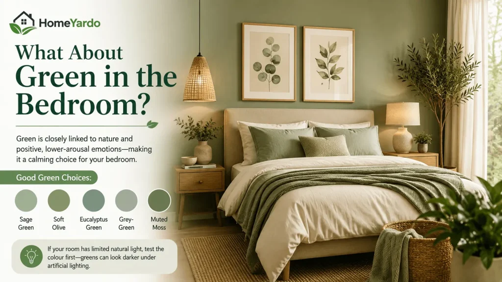
Green is another option for a bedroom because it is closely associated with nature and is often linked with positive, lower-arousal emotions in colour research.
Muted greens can work especially well when paired with natural materials.
Good choices include:
- Sage green
- Soft olive
- Eucalyptus green
- Grey-green
- Muted moss
These shades can create a connection with outdoor environments without making the bedroom feel overly colourful.
If the room receives limited natural light, test the colour before painting. A green that looks soft in a bright showroom can appear considerably darker under artificial lighting.
Should You Avoid Red and Orange in the Bedroom?
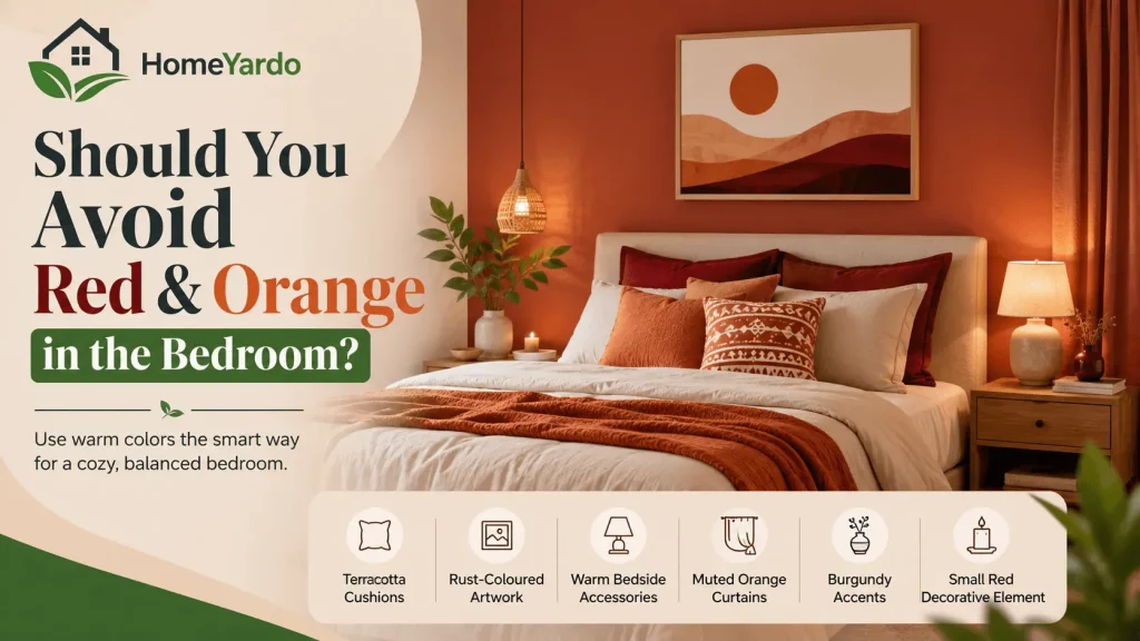
Not necessarily. Red and orange are associated with higher-arousal emotional responses in colour research, but that does not mean everyone will find them stressful. Personal preference and context still matter.
If you love warm colours, you can use them in smaller doses rather than covering every wall.
Try:
- Terracotta cushions
- Rust-coloured artwork
- Warm bedside accessories
- Muted orange curtains
- Burgundy accents
- A small red decorative element
This gives the room warmth without allowing a strong colour to dominate your entire visual field.
Why Soft Finishes Can Work Better in a Restful Bedroom
Colour is only part of the visual experience. Surface finish changes how much light the colour reflects.
Glossy surfaces can bounce light around the room and draw attention to the wall. Matte or low-sheen finishes generally produce a softer appearance.
For a bedroom intended to feel restful, a matte or low-sheen wall can therefore be a sensible choice. It reduces distracting reflections and gives muted colours a softer appearance.
The best choice still depends on the room and how easily the surface needs to be cleaned. A practical bedroom should balance appearance with maintenance rather than choosing a finish based only on psychology.
Using Colour to Support a Home Office
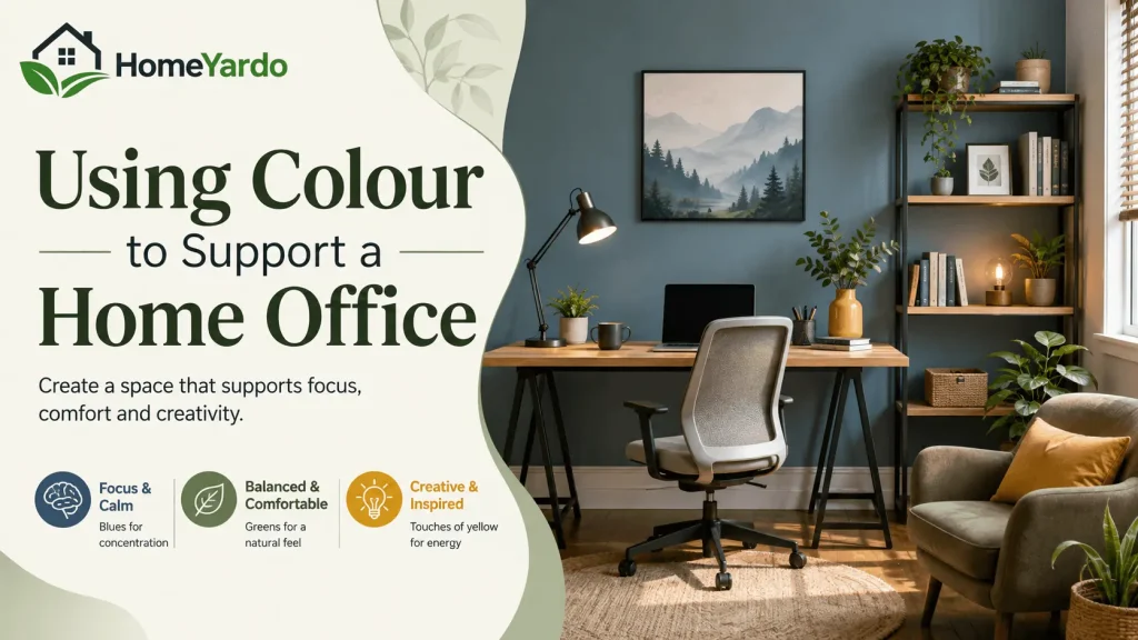
A home office needs a different atmosphere again. You may want the room to feel calm enough for long periods of concentration while still having enough visual energy to prevent it from feeling dull.
Colour research suggests that environmental colour can relate to mood, perception and behaviour, but the evidence is not strong enough to say that one wall colour will automatically make someone more productive. Reviews have also highlighted limitations in existing environmental colour research.
That means your personal response should carry significant weight.
If you find blue relaxing and easy to work around, it may be a good office colour. If blue makes you feel sleepy or disconnected, another shade may work better.
Blue for Focus and Calm
Blue is a popular home-office choice because it can create a calm visual background.
Try muted versions rather than extremely saturated shades:
- Soft blue
- Slate blue
- Blue-grey
- Muted teal
- Dusty blue
These can provide colour without making the entire room feel visually intense.
Blue can also work well behind a desk because it creates a defined background for video calls while keeping the overall space relatively restrained.
Green for a Comfortable Work Environment
Green can be useful when you want a connection with nature and a softer visual environment.
Consider sage, muted olive or soft eucalyptus rather than extremely bright green. Pairing green walls with wood, neutral furniture and natural textures can create a balanced workspace.
The claim that green is universally “the best colour for the eyes” should be treated carefully. There is not enough evidence to say that simply looking at a green wall prevents eye strain. Screen ergonomics, viewing distance, lighting and regular breaks matter much more for visual comfort.
Still, a muted green can make an office feel pleasant and less visually harsh, which may be useful if you spend many hours there.
Can Yellow Help Creativity?
Yellow is often associated with positive and higher-arousal emotions, and colour research has found recurring associations between yellow, orange and positive emotional responses.
That makes yellow an interesting option for creative spaces.
The important part is intensity.
A very bright yellow across four walls can become visually demanding. A softer yellow or a small amount of yellow can provide warmth without taking over the room.
Try yellow through:
- An accent wall
- Artwork
- Shelving
- A desk lamp
- Cushions
- Decorative objects
This approach gives you flexibility if your response to the colour changes over time.
Lighting Can Change How Your Colour Feels
A paint colour does not look the same throughout the day.
Natural daylight can make a wall appear lighter and more vibrant. Warm artificial bulbs can make the same colour appear softer or more yellow. Cool lighting can make some shades appear sharper or more blue.
This is why a colour that looks perfect on a small sample in a store may look completely different on a full wall.
Before committing to a colour:
- Put a large sample on the actual wall.
- Check it in morning daylight.
- Look at it during the afternoon.
- Turn on the room’s evening lights.
- Check it next to your furniture and flooring.
- Look at it from different parts of the room.
Do not judge the colour only from a phone or computer screen. Digital displays vary, and the colour you see online may not match the paint or material in your home.
Colour Temperature and the Feeling of a Room
- Colours are often described as warm or cool. Warm colours include reds, oranges and many yellows. Cool colours generally include blues, greens and blue-greens. Research suggests that warm and cool colours can produce different emotional associations, although the effect depends on hue, saturation and lightness rather than temperature alone.
- This gives you another way to think about room design. A cool palette may suit a room where you want a quieter atmosphere. A warm palette may be useful where you want energy, comfort or social warmth.
- You can also combine them. For example, a bedroom could use a muted blue wall with warm wood flooring, warm wood furniture and cream bedding. The wall provides the cooler visual base while the natural materials prevent the room from feeling cold.
The Size of the Room Matters
- Colour can also change how large or enclosed a room appears. Lighter colours tend to reflect more light and can make a small room feel more open. Darker colours absorb more light and can make a space feel more enclosed.
- That does not mean dark colours should only be used in large rooms. A darker bedroom can feel comfortable and intimate when balanced with suitable lighting and lighter furnishings. Likewise, a small bathroom can use a darker accent wall without making every surface dark.
- Think about the effect you want rather than following a strict rule. If your aim is to make a narrow bathroom feel brighter, a light wall colour combined with good lighting may help. If you want a bedroom to feel cosy, a deeper muted shade may work better.
Your Personal Response Matters
Colour psychology should never override your own preferences.
Research can identify common colour-emotion associations, but people do not all experience colour in exactly the same way. The 2025 systematic review found many-to-many relationships between colours and emotions, meaning one colour can be associated with several emotions and one emotion can be associated with several colours.
Your memories can also influence how you react to a colour.
Someone may associate blue with peaceful holidays and open skies. Another person may associate the same colour with a cold institutional environment. Both responses can be genuine.
That is why the best colour for your home is not necessarily the colour that a generic colour chart labels as “calming.”
Ask yourself:
- How do I feel when I look at this colour?
- Does it feel comfortable after several hours?
- Does it work with the room’s natural light?
- Does it suit my furniture?
- Will I still like it after the novelty wears off?
- Does it match what I actually use this room for?
These questions make colour psychology much more practical.
How to Match Colour to the Purpose of Each Room
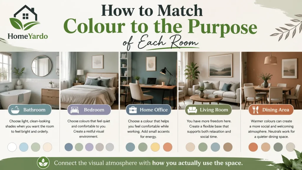
The easiest way to apply colour psychology at home is to start with the function of the room.
Bathroom
Choose light, clean-looking shades when you want the room to feel bright and orderly. White, soft blue, pale green and warm neutrals can all work.
Bedroom
Choose colours that feel quiet and comfortable to you. Muted blues, soft greens, lavender, warm neutrals and soft greys can create a restful visual environment.
Home Office
Choose a colour that helps you feel comfortable while working. Muted blue and green can create a calm background, while small amounts of yellow or warmer colours can add energy.
Living Room
You have more freedom here because the room may need to support both relaxation and social activity. Warm neutrals, muted greens, soft blues and earthy shades can provide a flexible base.
Dining Area
Warmer colours can create a more social and welcoming atmosphere. If you prefer a quieter dining space, neutral or muted colours may be better.
The point is not to assign one “correct” colour to every room. It is to connect the visual atmosphere with how you actually use the space.
Small Colour Changes Can Make a Difference
You do not need to repaint your entire house to experiment with colour.
Start with small changes.
Replace neutral cushions with muted blue or green ones in the bedroom. Add a warm-toned accessory to a white bathroom. Introduce a yellow desk lamp or piece of artwork into a home office.
Live with the change for a few days.
Notice how the room feels at different times and under different lighting conditions. If you like the result, you can make a larger change later.
This gradual approach is also useful if you are unsure about committing to a strong wall colour.
Common Mistakes When Using Colour Psychology
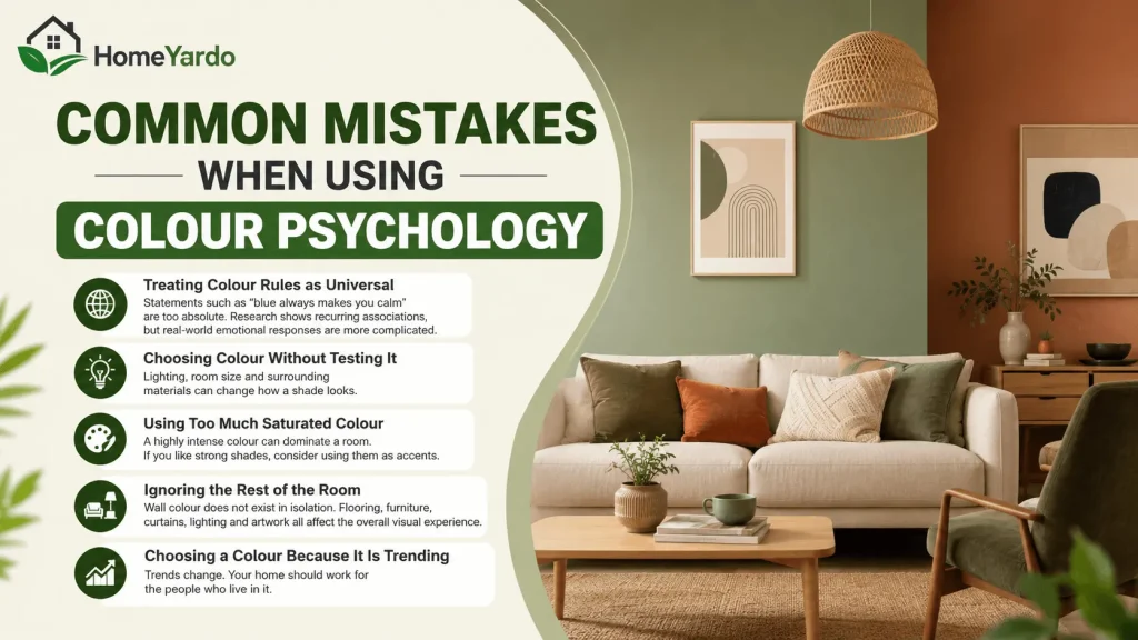
Treating Colour Rules as Universal
Statements such as “blue always makes you calm” are too absolute. Research shows recurring associations, but real-world emotional responses are more complicated.
Choosing Colour Without Testing It
Lighting, room size and surrounding materials can change how a shade looks.
Using Too Much Saturated Colour
A highly intense colour can dominate a room. If you like strong shades, consider using them as accents.
Ignoring the Rest of the Room
Wall colour does not exist in isolation. Flooring, furniture, curtains, lighting and artwork all affect the overall visual experience.
Choosing a Colour Because It Is Trending
Trends change. Your home should work for the people who live in it.
A Practical Way to Choose the Right Room Colour
If you are unsure where to start, use this simple process.
Step 1: Define the purpose of the room.
Decide whether you want relaxation, concentration, energy, comfort or a combination.
Step 2: Choose a colour family.
Start with blue, green, yellow, white, neutral or another family that matches your desired atmosphere.
Step 3: Adjust the intensity.
If the colour feels too strong, look for a softer or less saturated version.
Step 4: Consider natural light.
Check whether the room receives bright sunlight, indirect daylight or very little natural light.
Step 5: Test the actual material.
Use a paint sample, wall covering sample or physical swatch rather than relying only on an online image.
Step 6: Live with it.
Look at the sample at different times of day before making the final choice.
Step 7: Add supporting colours.
Use furniture, textiles and accessories to balance the main wall colour.
This process keeps colour psychology practical rather than turning it into a rigid set of rules.
Colour Psychology Is a Design Tool, Not a Guarantee
Colour can influence how we perceive a room and is consistently associated with certain emotional responses in research. At the same time, the scientific evidence does not support treating individual colours as guaranteed tools for changing mood, sleep or productivity.
The strongest approach is to combine research with the practical conditions of your home.
Use lighter and softer colours when you want an open, quiet atmosphere. Consider muted blues and greens for rooms where relaxation matters. Use warmer or more energetic colours in smaller amounts when you want visual stimulation. Pay attention to lighting, saturation and surface finish, not just the basic colour name.
Most importantly, choose colours that you personally enjoy living with.
Match Your Colours to How You Use Each Room
You do not need a complete renovation to benefit from colour psychology. Small changes to the surfaces and accessories around you can change the visual character of a room and may influence how you experience the space.
Start by looking at the rooms where you spend the most time. Does your bedroom feel visually busy when you are trying to relax? Does your home office feel dull during long working sessions? Does your bathroom feel dark even though the walls are white?
The answers can help you decide where colour needs to change.
A calm bathroom may benefit from a clean white base with natural accents. A bedroom may feel more comfortable with a muted blue, green or neutral palette. A home office can use restrained colour to create a comfortable working environment, with warmer accents where you want more energy.
There is no single perfect colour for every home. The most useful approach is to match the colour, intensity, lighting and finish to the purpose of the room while keeping your own preferences in the decision.
When you choose colour with both research and real-life use in mind, your rooms can look better while feeling more suited to the way you actually live in them.
FAQ’s
Color psychology in interior design is about the impact of different colors and their visual qualities on how a room is seen and experienced by individuals. The result will be influenced by color, saturation, brightness, lighting and personal preference.
Calm bedroom atmospheres can be created by soft, muted colors like pastel blue, sage green, lavender and warm neutrals. The ideal decision also depends on your lighting, furniture and your own response to the color.
White is a common color choice for bathrooms because it offers a clean, bright and tidy look. Soft blue, light green and warm neutrals are also good choices, especially when coupled with the right lighting and natural accents.
The soothing blue and green tones can produce a tranquil working environment, while yellow tones can offer a sense of warmth and enthusiasm. Or choose a shade that you are happy with for lengthy periods of time rather than a specific color rule.
Yes, color may affect how people perceive and feel an area emotionally. But the effect is different for each person and depends on such things as brightness, saturation, lighting, culture and personal experiences.
While blue is connected to feeling peaceful and less stimulated, there’s not enough research to guaranty a blue bedroom would immediately lead to greater sleep. Quality of sleep also depends on light, temperature, noise, tension and other elements.
Not necessarily. The bright colors can create a more dynamic ambiance which may not be suitable for someone searching for a tranquil bedroom. If you love vivid colors, employing them as tiny accents can add personality without making the entire area too exciting.
Yes. Natural sunshine and artificial light can greatly affect the appearance of a color. It’s always advisable to trial a color on the wall itself and see how it looks at different times of the day before committing to a final decision.