
How Commercial Interior Design Principles Make Any Room Feel More Intentional

Instead of being designed, most rooms are furnished. You decide to add an accent coffee table to complete the look after a sofa arrives and you roll out a rug beneath it. The room is full and looks pretty good after a few rounds of this. However, the room never quite settles into the version of itself you envisioned, and something feels strange.
Every day, commercial interior designers deal with a large-scale version of this issue. A hotel lobby, a restaurant dining room, or a corporate office are examples of spaces that cannot afford to feel haphazard. Every component must merit its position, and the environment as a whole must serve the needs of its users.
Commercial designers employ simple, low-cost principles to accomplish this. They mostly deal with sequence: completing tasks in the proper order, verifying each choice against those that surround it, and avoiding the temptation to purchase furniture before you know where it will end up.
Here are six of those ideas and how to put them into practice in any room of your home.
1. Space Plan Before You Select Furniture
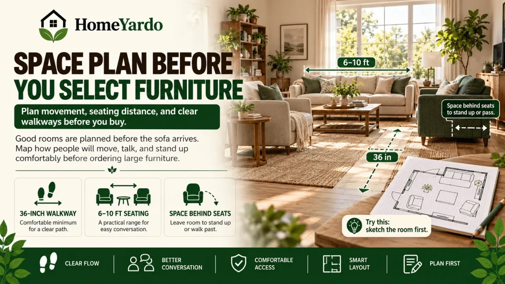
Before a commercial designer picks a chair, they draw the room to scale and work out how people will move through it. At home, we often do it backwards: we buy the sofa, then find it blocks the path to the window.
Check three things on your drawing:
- A 36-inch walkway. The ADA Standards for Accessible Design require this width for accessible routes and it is a comfortable minimum in any home.
- Seating 6 to 10 feet apart. This is a common design guideline. Closer feels crowded and farther makes conversation hard.
- Space behind every seat to stand up or walk past.
Try this: Sketch your room on graph paper, one square per foot, or use a free room-planning app. Do it before you order anything large.
2. Circulation Clearances Are Not Optional
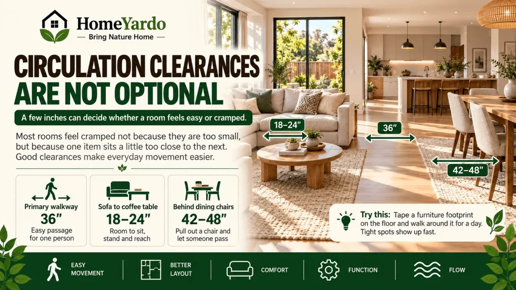
Commercial codes set minimum clearances because they reflect how bodies actually move. No inspector will visit your living room, but your body works the same way in it. Most rooms that feel cramped are not too small. One piece is just a few inches too close to the next.
Where
Clearance
What it protects
Primary walkway
36″
Easy passage for one person
Sofa to coffee table
18-24″
Room to sit, stand and reach your cup
Behind dining chairs
42-48″
Room to pull out a chair and let someone pass
The 36″ figure has a legal source. The other two are widely used guidelines, so treat them as dependable rules of thumb.
Try this: Mark a large piece’s footprint on the floor with painter’s tape and walk around it for a day. You will feel any tight spot right away.
3. Every Finish Talks To Every Other Finish

A finish is any surface you can see and touch: flooring, paint, fabric, wood, metal. In a commercial interior design project, the designer never picks these one at a time. Each is checked against all the others, because a mismatch in one place shows up everywhere.
Habit
What to do
Match undertones
Keep warm finishes with warm ones (cream, honey oak, brass) and cool with cool (gray, chrome). Mixed undertones make a room feel “off.”
Repeat one metal
Use a single metal for hardware, fixtures and faucets so separate objects read as a set.
Test samples together
Colors shift with their surroundings, so a store swatch tells you little.
Flooring covers the largest surface in the room and sets the undertone for everything else. If you are choosing new flooring, browse the Homeyardo Flooring category and order samples before you commit.
Try this: Place flooring fabric and paint samples together in the room and check them in natural light, morning to evening. A gray that looks neutral at noon can turn blue by dusk.
4. Scale And Proportion Are The Most Common Residential Mistakes

Scale is how big a piece is compared with the room and the pieces around it. Commercial designers attach a rule to every item and check it against a measured drawing. At home, scale is usually guessed.
| Piece | Rule |
|---|---|
| Area rug | Front legs of all seating rest on the rug |
| Pendant over a table | 30-36″ above the tabletop |
| Art over a sofa | Bottom edge 6-8″ above the sofa back |
| Coffee table | 1-2″ below the sofa seat |
| Sofa | 3-6″ from the wall |
These are designer guidelines for standard ceilings and furniture, so adjust slightly for unusual rooms. When in doubt, go one rug size up. Rugs that are too small are one of the most common mistakes.
Try this: Cut cardboard to the exact size of a planned piece and set it in the room before you buy.
5. Lighting In Three Layers

A well-designed commercial space never relies on a single light source. Most homes have only an overhead fixture, which lights everything evenly and highlights nothing.
| Layer | Job | Examples |
|---|---|---|
| Ambient | Fills the room with general light | Ceiling fixtures, recessed lights |
| Task | Lights a specific activity | Reading lamp, desk lamp, under-cabinet lights |
| Accent | Draws the eye to a feature | Picture lights, shelf spotlights |
Lamps at table or floor height create soft pools of light that make a room feel welcoming, which is why hotels and restaurants rely on them. Dimmers let one room suit several moods.
Try this: Add one floor or table lamp to a room that relies only on overhead light. Turn the ceiling light off in the evening and see how it feels.
6. Accessories Are Specified Rather Than Collected

Every accessory is verified by commercial designers against the surface it will be placed on. Over the years, gifts, souvenirs, and items from the sale table are accumulated at home. Even though each is beautiful, when combined, they can read as clutter.
Ask three questions about each object during one editing pass.
- Scale: Is it the right size for this surface?
- Material: Does it relate to the materials around it?
- Place: Does it belong here, or does it just happen to be here?
Horizontal surfaces need breathing room. Fewer objects, placed on purpose, read as designed.
Try this: Clear one surface completely. Put back only what passes all three questions and store the rest for a few weeks.
Conclusion
If you can only remember one thing, it should be the sequence: arrange the area, make sure there are no obstructions, arrange the finishes, ensure that the scale is correct, add lighting, and modify the accessories.
It doesn’t require a big budget. All you need is a little perseverance and the proper sequence.
Ultimately, these are merely suggestions; you are not required to complete them all at once. Consider it an experiment. Choose a room, begin with the scale drawing, and proceed down the list. You will notice the difference in every other room you enter if you take even one or two of these actions.
FAQs
Commercial interior design principles are planning methods used to make spaces functional, navigable, visually coordinated, and appropriate for their users. Common principles include space planning, circulation, scale, proportion, material coordination, lighting, and purposeful furniture placement.
Yes. Although commercial and residential spaces have different requirements, homeowners can still apply ideas such as planning circulation before buying furniture, comparing finishes together, checking scale, and using several types of lighting.
Start with the room’s function, dimensions, fixed features, doors, windows, and circulation routes. Once the layout works, furniture, finishes, lighting, and accessories can be selected around that plan.
There is no single measurement that suits every room. Clearance depends on furniture dimensions, room geometry, accessibility needs, doors, household habits, and how people move through the space. Design guidelines can be useful starting points, but they should be adjusted to the room.